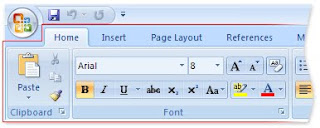
So for the first time the computer literacy class I teach has been forced to switch over to MS Office 2007 products, and hence this past week I was finally forced to use the MS Office Ribbon interface. I tried to stay away from it, but now here it is finally. I really don't like it.
Here's the thing I really don't like about (aside from just the radical change from anything that's come before): It's semi-impossible to describe to someone else (say, a student) where they should be clicking.
In some sense, this is basically the primary disadvantage of the GUI having been doubled in intensity. With a command-line interface, it's easy to write out your instructions and transmit them in writing or verbally to another person. The GUI makes that piece of business a lot harder (now the geographic location that you're clicking on makes a big difference, and you wind up clumsily describing the pictures and icons that you're trying to activate).
So with the MS Office Ribbon, this is even more exacerbated. At least with the traditional menu bar, there was a linear order to each step of a process. Click on one menu item, another linear list drops down, find one item in that list, proceed to the next, etc. For example, to center the contents of a cell in Excel, I could provide a handout that says, "Click on: Format > Cells > Alignment > Horizontal > pick 'Center'". But now, I have to say something like "On the Home Tab, find the Alignment section, and kind of near the middle of that section there's a button that kind of has its lines centered, click on that". Very, very clumsy... and more so for lots of other examples that we can probably think of.
Ribbon|Segment works just like Menu|Item.
ReplyDeleteCentering can be found in Home|Alignment.
(There's tooltips if you aren't sure which of the handful buttons is the one you want)
I think there's a bigger issue at stake here: should you be teaching someone how to do something by giving them step-by-step instructions on which pixels to click, or should you be teaching them how to figure out what they want to do based on this new UI paradigm? Instead of saying "go to the x tab and find the y group and click the z dropdown", maybe it would be more logical to explain "this is called a ribbon. it's organized by related tasks, so if you want to format z, you should look in the x tab, and then find the y area, because z is a y-type action". By teaching them *how* to *use* the ribbon, instead of where to click, you'll be making it much easier for them in the long run.
ReplyDelete